- 登入
- 註冊

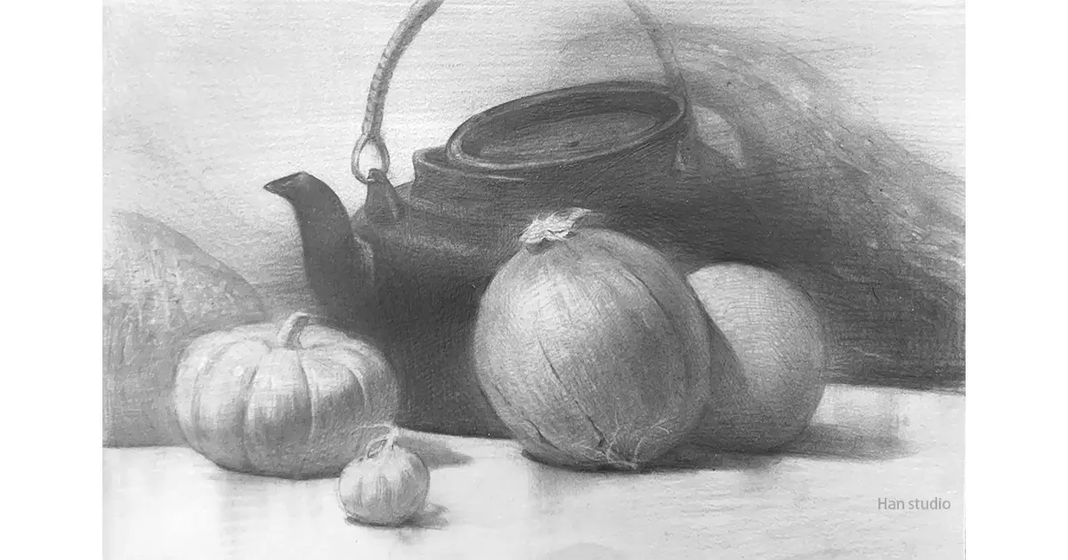
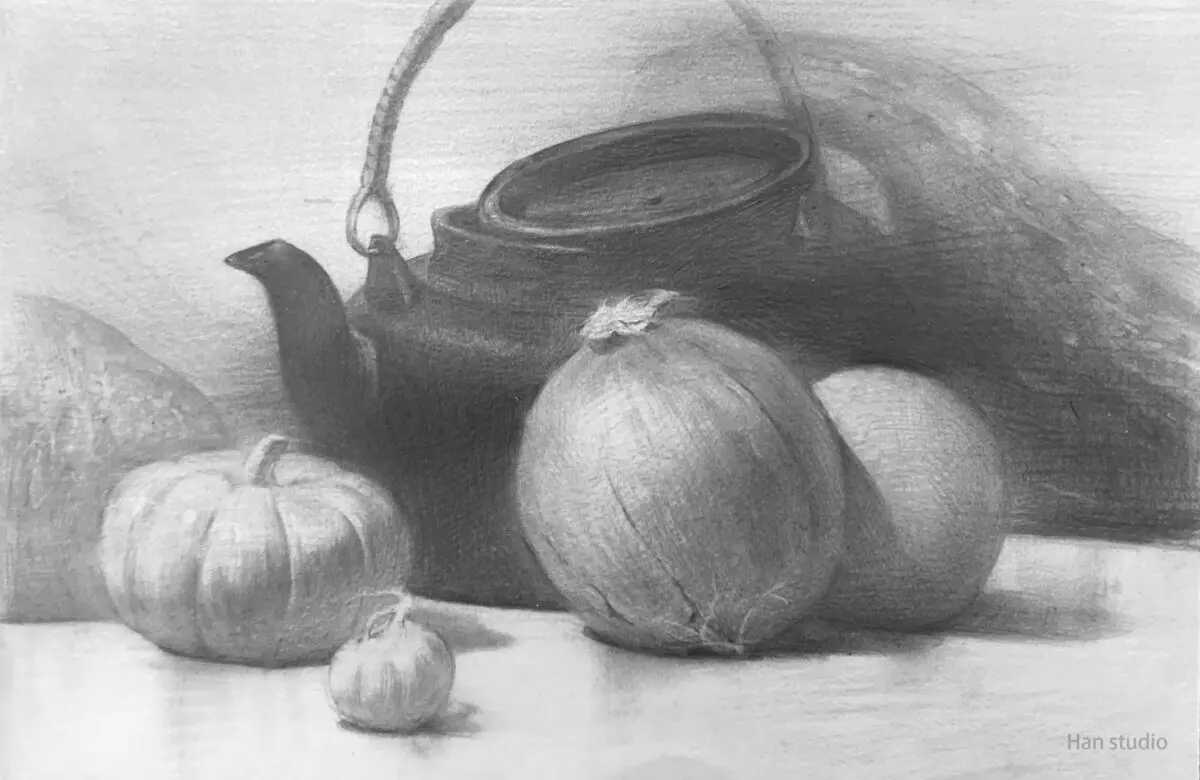
This week's pumpkin still life project is an interesting arrangement of shapes, which gives us a chance to understand how objects of different brightness and characteristics can be overlapped.
If you are interested in how to arrange the shapes and compositions, please read along with the second picture to help you understand 🙋.

By generalizing the whole object, the goal is to stabilize the large structures in the picture first, and then balance the picture by putting in small shapes later.


In the composition, pay attention to the different shapes, because each spacing arrangement, resulting in changes, we try to achieve the objects are not equally spaced from each other with changes in the arrangement.
Each object is arranged to create focus by concentrating or dispersing shapes.
The size and shape of the objects should vary, but the overall layout should be harmonious.
For details, please refer to the simplified diagram in the upper left corner.


The overlapping relationship between objects is utilized to create a sense of depth and space between the front and back.
In addition, when objects overlap, the resulting undulation of the edge lines is an interesting feature that will make for interesting changes in the screen.


By adjusting the shapes and positions, we can maintain the visual balance of the screen and emphasize the focus area. For example, to balance the large shape on the left with the small shape on the right, please refer to the small picture below which looks like a cutting board.

Objects may differ in brightness from one another due to their inherent color, such as a yellow pumpkin and a black teapot.
Therefore, by placing objects of different brightness together, it is easier to highlight the main characters (large color contrast between the front and back objects) and the supporting characters (small color contrast between the front and back objects), e.g. placing a pumpkin and an onion in front of a dark teapot is easier to create a contrast of brightness, and become the focal point of the painting.


I hope this introduction to the structure can help you recognize and understand the key points of the compositional configuration, if there are any subjects you want to see or painting methods you want to know, welcome to leave a message or private message me, I wish you a happy painting!
If you want to learn to draw, but don't know how to start, or are interested in understanding what drawing is all about.
Welcome to join line Contact meIn my classroom, I organize the way I learn to draw in a clear and organized way.
Click here to learn more about the Painting Program
How to Learn Perspective Painting: From Geometry to Spatiality
Boots Sketch Tutorial: Learn Proportions and Structural Lines
How to Master the Proportions,Shape, and Symmetry of a Teapot
Three Easy Steps to Drawing a Stuffed Duck with a Pencil
Mastering the Shape and Curvature of a Fishing Boat: Sketching Classroom Fishing Boat Drawing Tips