
- 登入
- 註冊
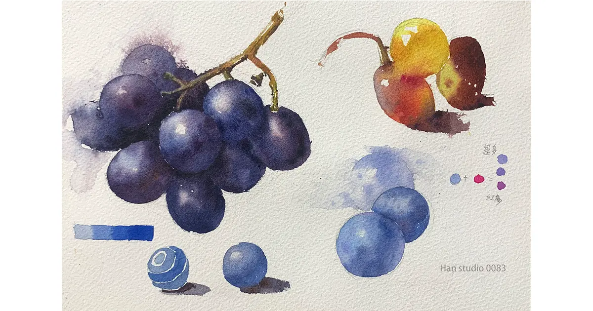
Record this week's watercolor lesson to practice variations between containers 🙋
The day before yesterday, the lecturer we invited to our studio seminar was able to demonstrate on the spot in a short period of time, out of the script, and I immediately felt that this required a huge amount of operational experience and time investment, and I thought of the last time I talked to a friend about the topic of intuition.
I remember reading a book that mentioned that intuitive judgment relies on countless hours of practice to internalize, but this practice must be planned and methodical, or with the help of a professional coach who can point out problems and correct them.
The second half of the compilation of grape watercolor knowledge, and suggested methods of operation, if you are interested in painting friends to look down together!
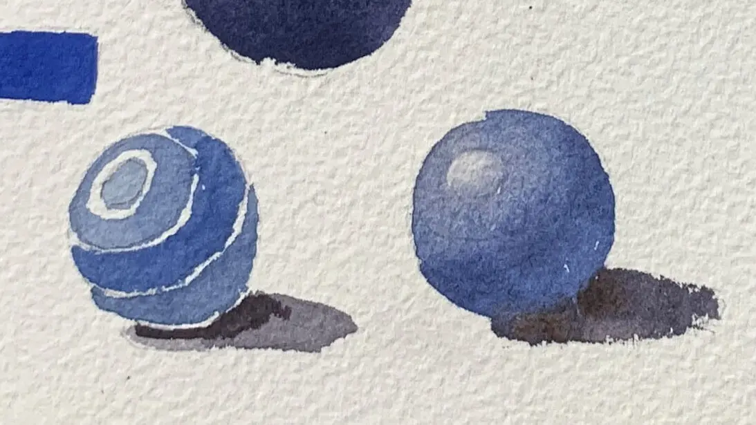
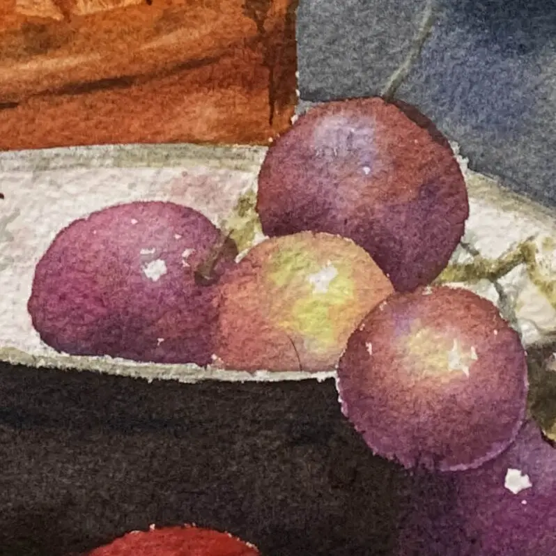
The grapes themselves are spheres that show the direction of the light source by observing the changes in light and dark areas.
The small picture on the lower left introduces the layering from light to dark to bring out the sense of the sphere, note that the Grape Interface is the key to express the sense of the sphere.
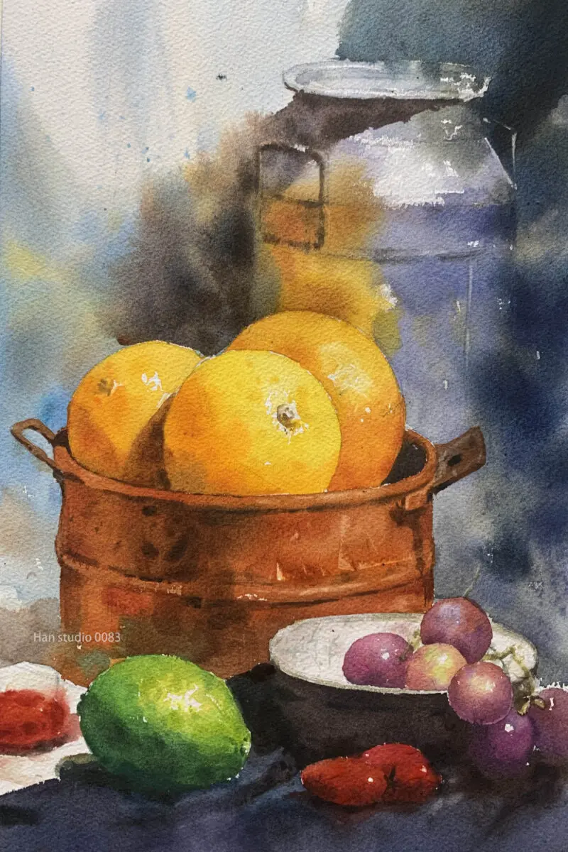
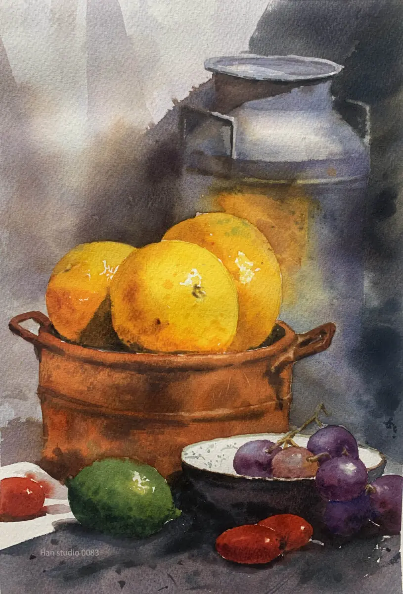
The grapes use cool colors (blue-purple), while the other group next to them is on the warmer side (orange and red tones).
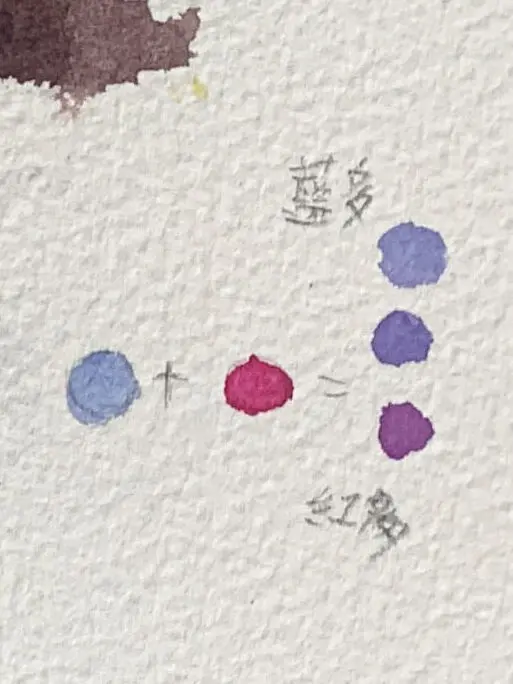
Pay attention to the proportions when mixing colors, for example: Purple can be bluish purple, reddish purple.
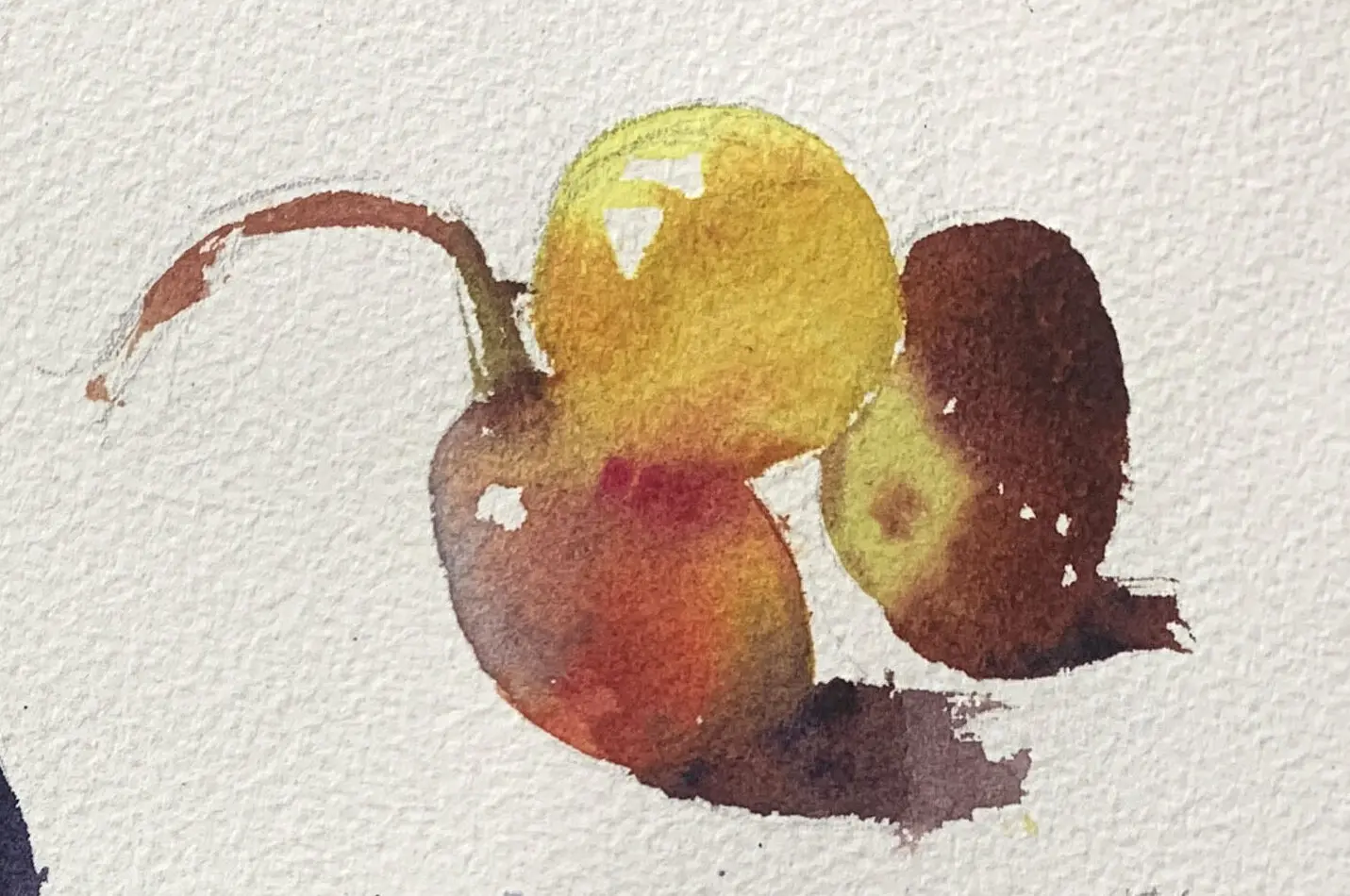
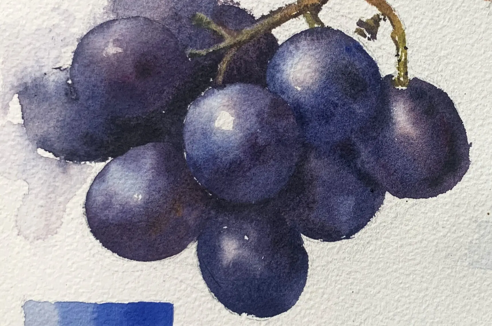
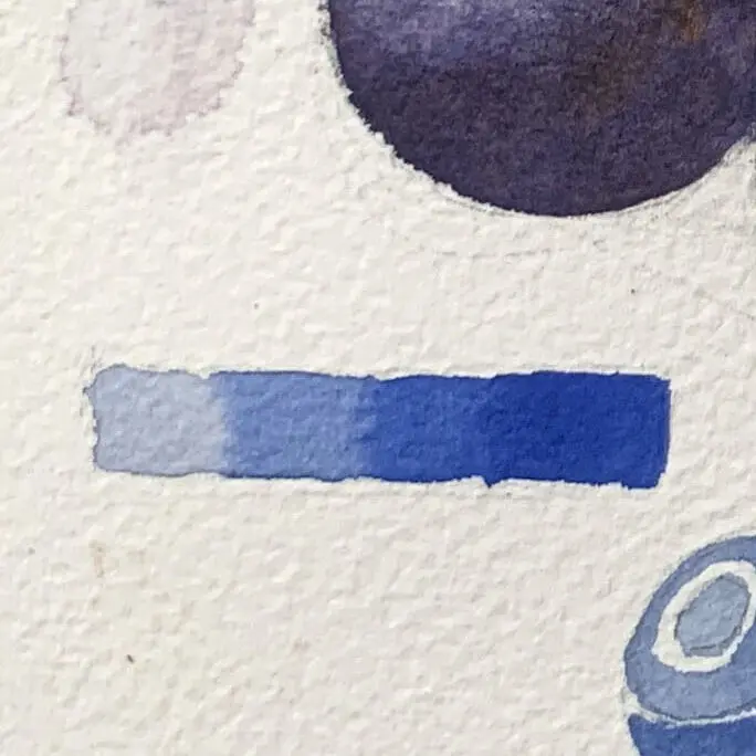
Before doing the gradient layer, please pay attention to the amount of paint is enough to paint the desired area, from the bright side of the water to the junction of the more water joining the thicker and thicker, control the concentration of paint on the tip of the pen.
Start by lightly drawing the outlines of the grapes and other fruits in pencil, paying attention to the relationship between the front and back and where they overlap each other.
The following drawing is a direct color transfer from the introduction.
When painting a glossy surface, leave the highlights uncolored, or you can apply a little water and start coloring around the highlights.
The glossy color can be watered down a bit more.
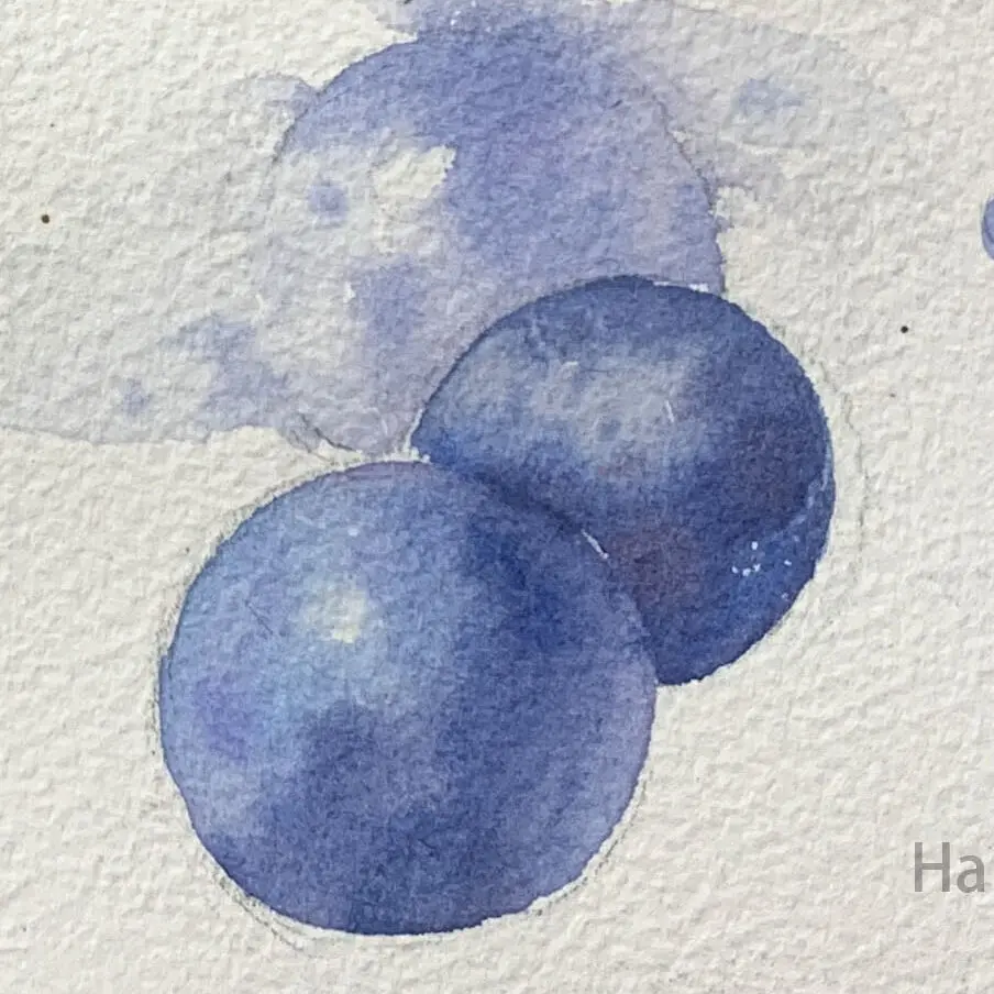
After observing the grapes, you can use a darker and more intense blue-purple color at the junction to make the sphere more three-dimensional.
By observing the blurring of the boundary between the dark side and the shadow, it is recommended to pick it up directly, and you can try to make changes in the color scheme.
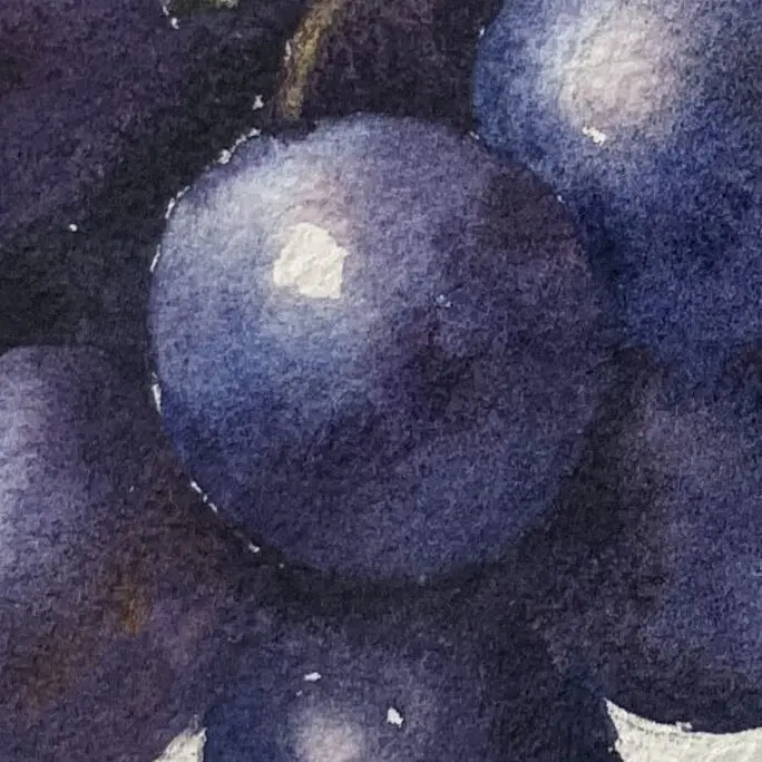
I hope this introduction to watercolor can help you recognize and understand the knowledge of grapes, if there are any subjects you want to see or painting methods you want to know, welcome to leave a message or private message me, I wish you a happy painting!
If you want to learn to draw, but don't know how to start, or are interested in understanding what drawing is all about.
Welcome to join line Contact meIn my classroom, I organize the way I learn to draw in a clear and organized way.
Click here to learn more about the Painting Program
Watercolor Mixing Tips: Achieve Natural Transitions Easily
How to Paint the Light and Dark Layers of a Monstera Leaf
How to Paint a Vibrant Yellow Bell Pepper Still Life
How to Paint Translucent Bananas in Watercolor: Color Variations and Chromatic Control Techniques