- 登入
- 註冊
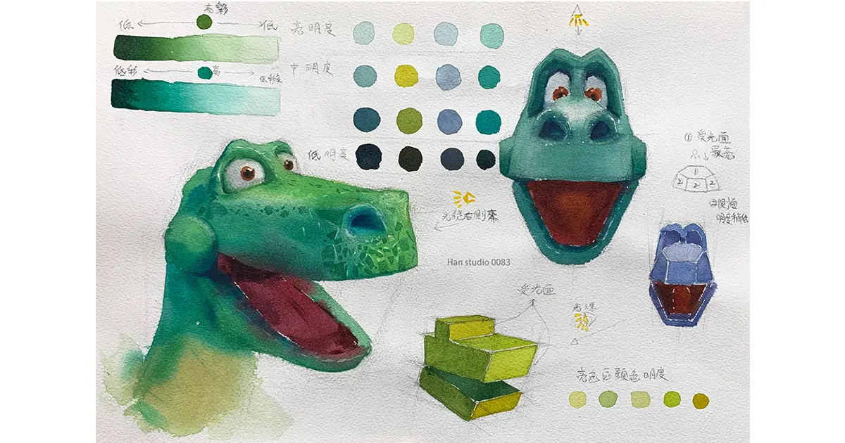
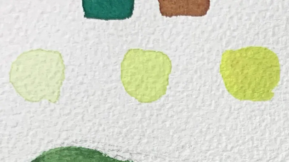
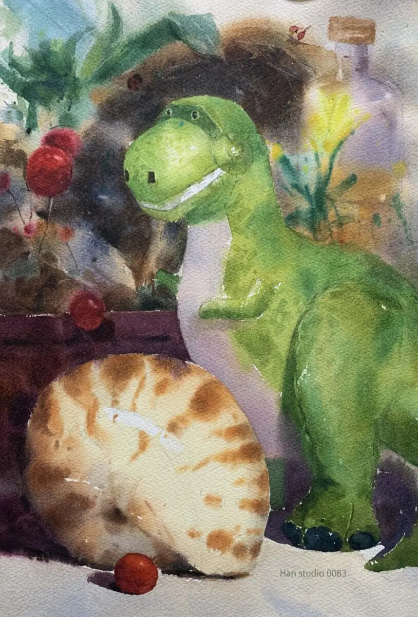
Continuing from last week's Dinosaur watercolor theme, I tried a few different green color combinations and found it challenging to make the changes subtle.
The following further understanding of the relationship between color brightness, color, interested friends together to look down Oh.
In color science, a primary color is a primary color that cannot be derived by mixing other colors.
For watercolor pigments, this usually means red, blue and yellow (magenta, cyan and lemon yellow are also used).
A color made by mixing two primary colors. Example:
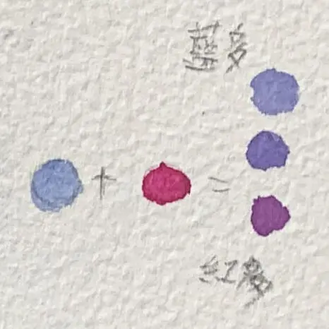
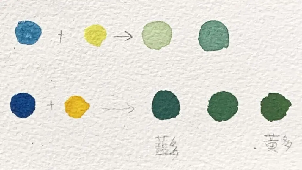
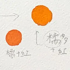
Colors extruded directly from the pigment strip, e.g., orange, purple, emerald green, etc.
These colors may be mixed by the manufacturer during the production of the pigments, but are not primary colors.
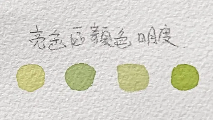
Chroma refers to the purity and saturation of a color, i.e., the vividness of the color.
Color is like the flavor of the fruit. The high chroma is like a freshly squeezed, juicy orange with a strong flavor;
The low coloration is like willow juice with a lot of water added, and the flavor is muted.
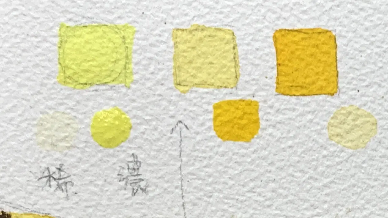
The color intensity (vividness) of a color decreases with the number of times it is mixed, for example, if yellow and red are blended to produce an orange, the blended orange will be less colorful than the orange extruded from a strip of pigment.
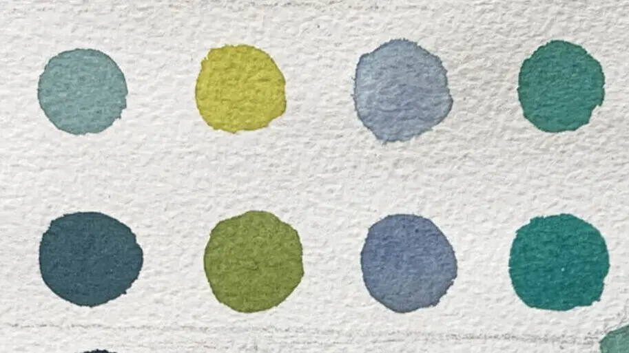
Gradient strips help us to understand how the intensity of a color affects the chromatic variation.
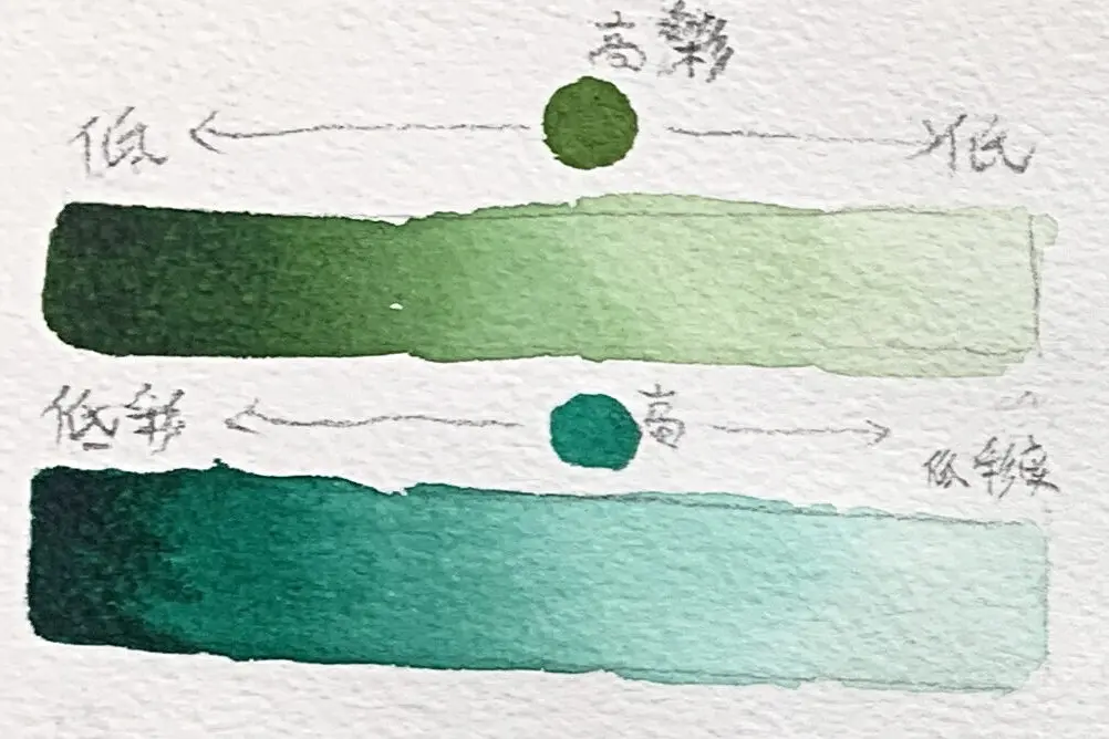
Brightness refers to how bright a color is, i.e. how light or dark it is.
Brightness is like the intensity of a light. High brightness is like a room where the sun shines; low brightness is like a dimly lit corner.
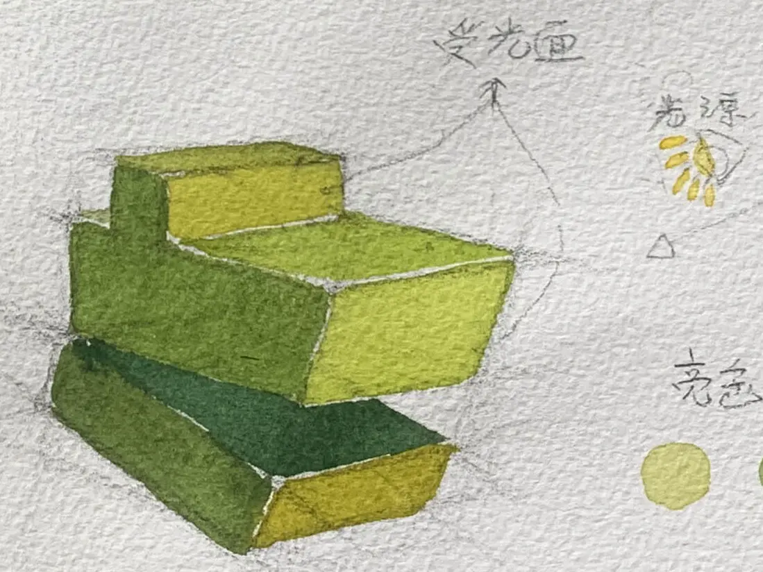
Color brightness can be divided into high, medium, and low brightness from top to bottom by referring to the middle block of the diagram.
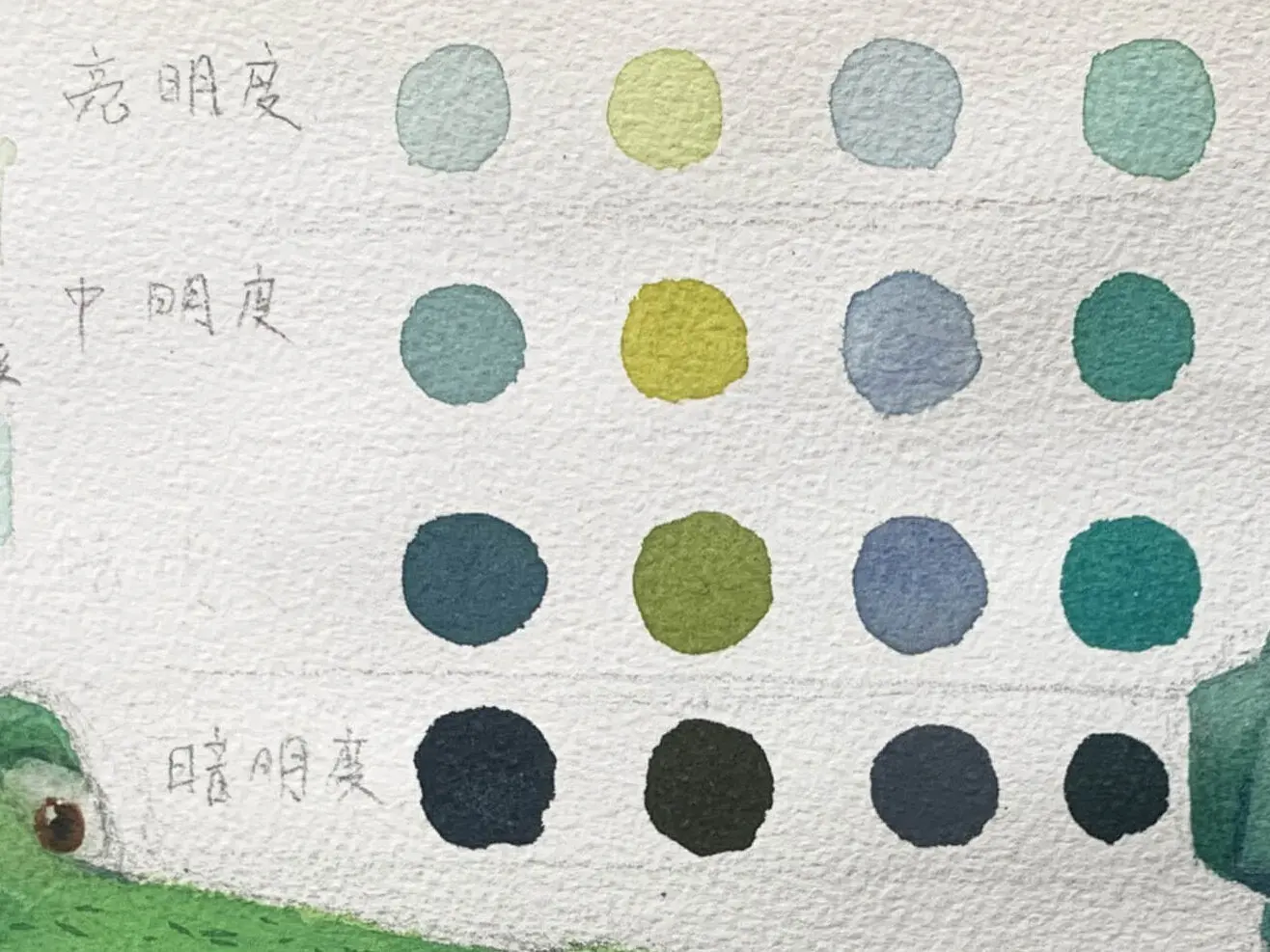
Brightness is an important element in painting to express light and shadow, space, and sense of three-dimensionality. We can briefly divide brightness into three types, light, gray, and dark brightness levels.
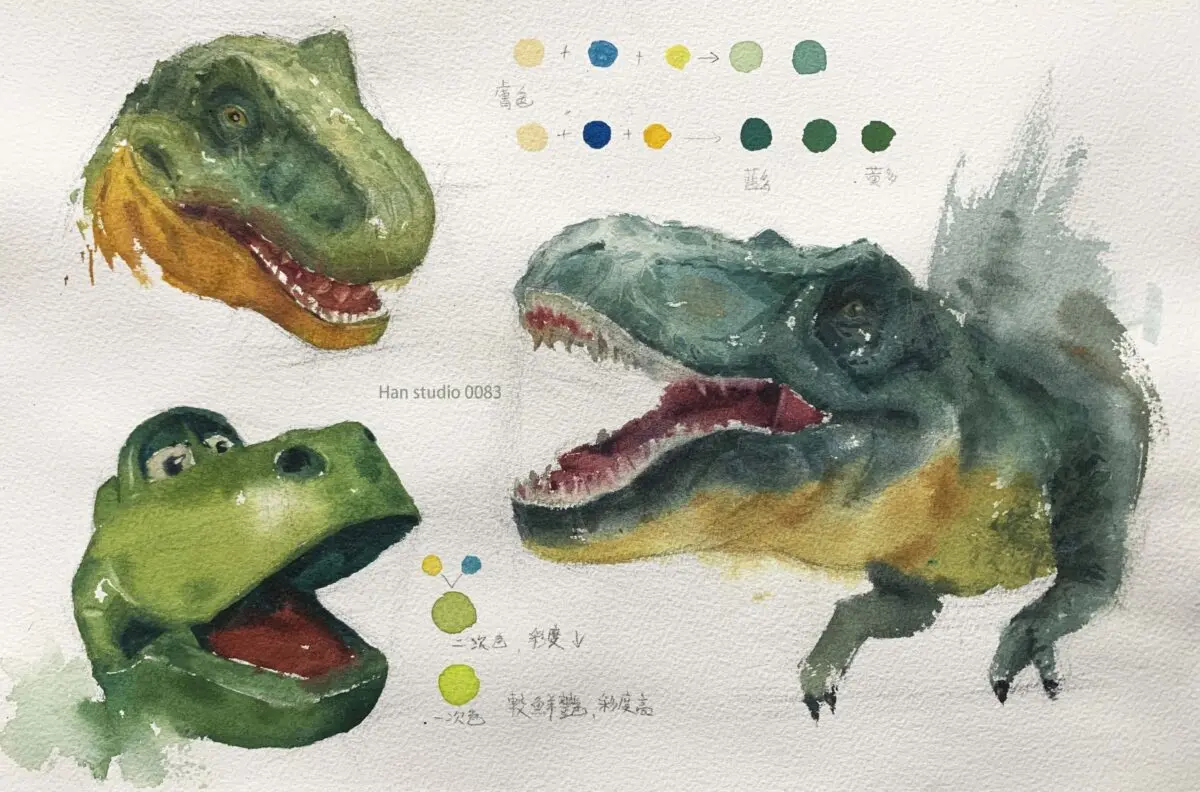
The green cube at the bottom of the picture.
In the light source from the right, simply divide the head into light side, shadow dark side, light side can be cadmium yellow, lemon yellow, blending the sky blue, the process must maintain the brightness of the color.
Shaded areas are not directly illuminated by light, and the green luminance needs to be separated from the bright color luminance.
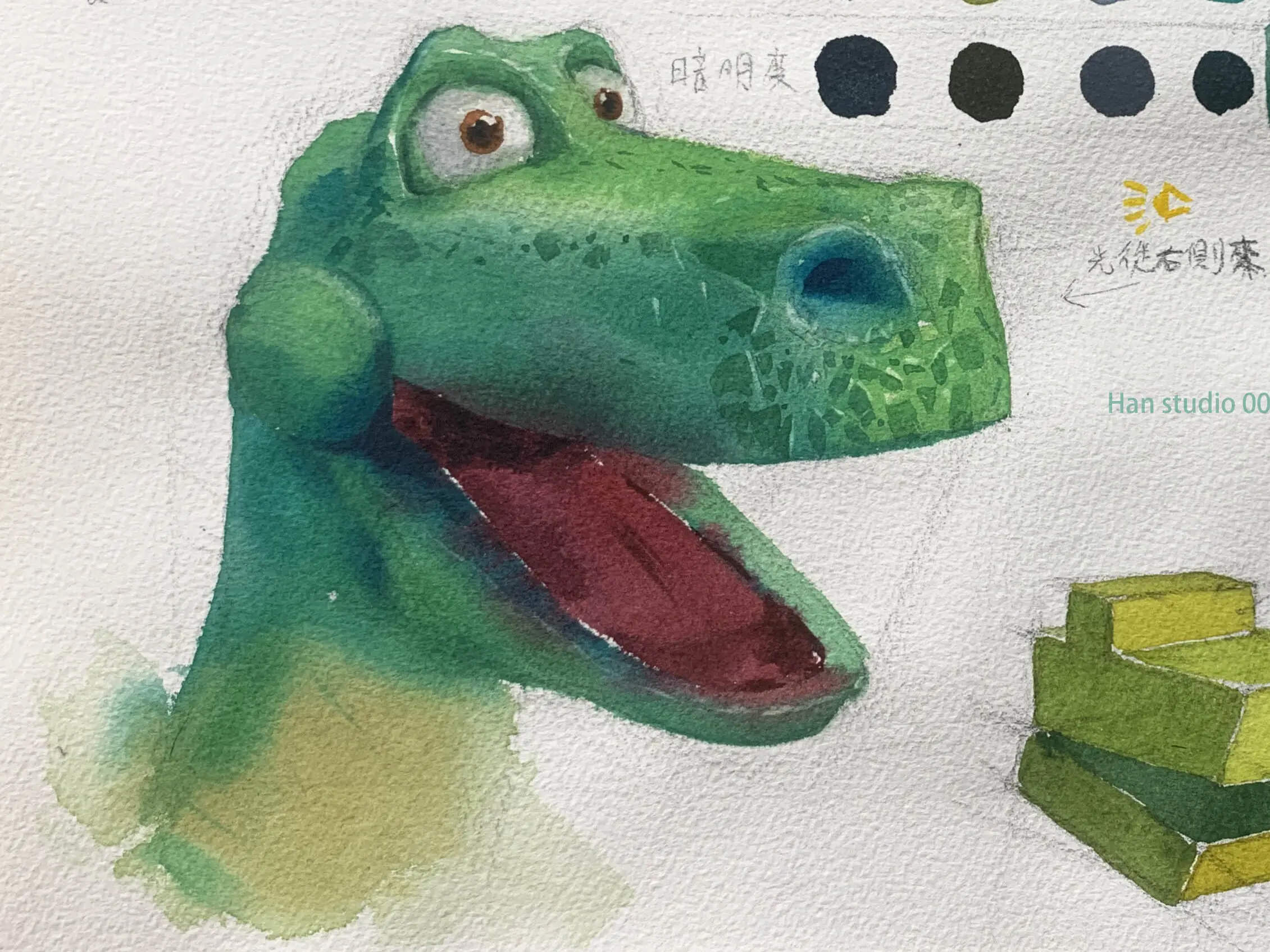
After understanding the light/dark logic of the above simplified square, the following is an example of a dinosaur head on the left:
The green of the bright side can be Grass Green (Hobin W277) or a diluted color, please refer to the Brightness Colors section.
Shaded areas of green can be used Prussian blue (greenish blue) to blend yellow, note that the proportion of blue can be a little more, brightness contrast, please refer to the medium brightness block color.
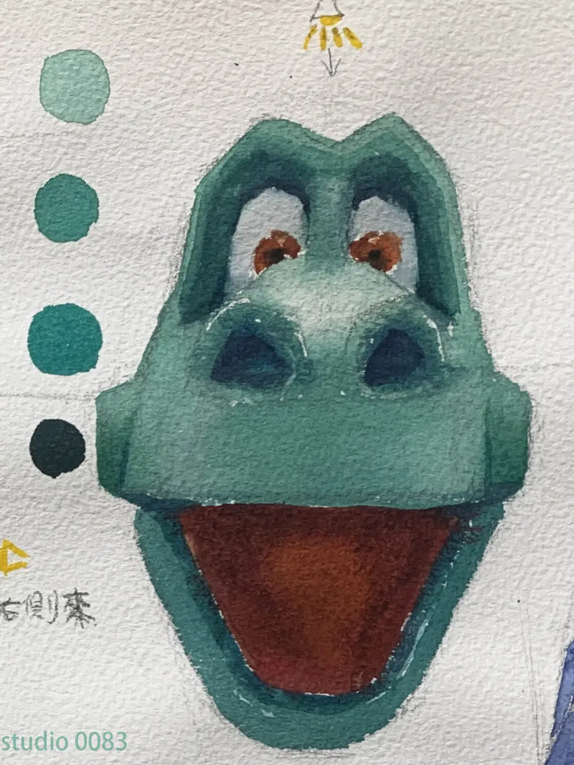
You can see that the lighted surface is bright and clear, while the shadows are toned with cadmium yellow and darker blue to open up the brightness between the blocks, and a sense of three-dimensionality is established.
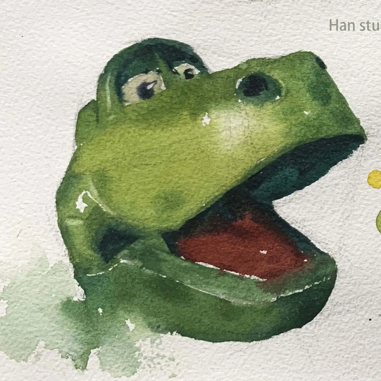
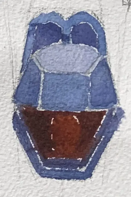
The dragon's head is divided into upper and lower layers, let's start with the upper layer.
The light source is from above, and we have simplified the upper faucet into two shades, a light purple on the lighted side as shade 1, and a blue-violet on the side as shade 2.
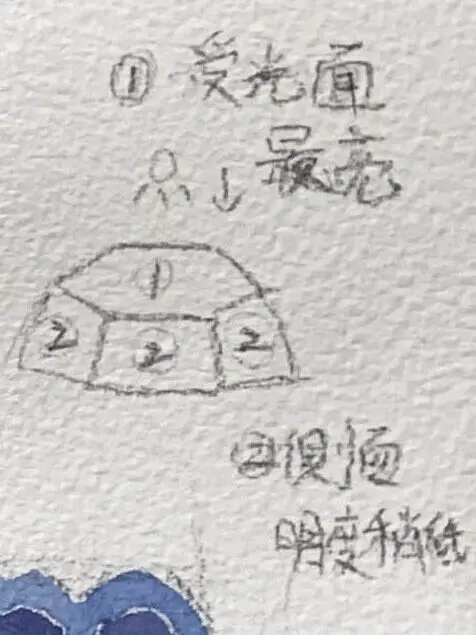
The chin is the lower layer, so the base brightness will be darker than the upper layer, you can use a deeper blue-purple, with different areas of brightness differences, you can build up the sense of the dragon head.
When we want to draw three-dimensionality.
Above is the introduction of color mixing, chroma and luminance, do you have difficulties in watercolor painting or color mixing?
If you want to learn to draw, but don't know how to start, or are interested in understanding what drawing is all about.
Welcome to join line Contact meIn my classroom, I organize the way I learn to draw in a clear and organized way.
Click here to learn more about the Painting Program
How to Watercolor Grapes: Master Light, Shadow & Gradients
How to Paint the Light and Dark Layers of a Monstera Leaf
How to Paint a Vibrant Yellow Bell Pepper Still Life
How to Paint Translucent Bananas in Watercolor: Color Variations and Chromatic Control Techniques
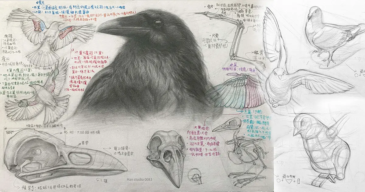
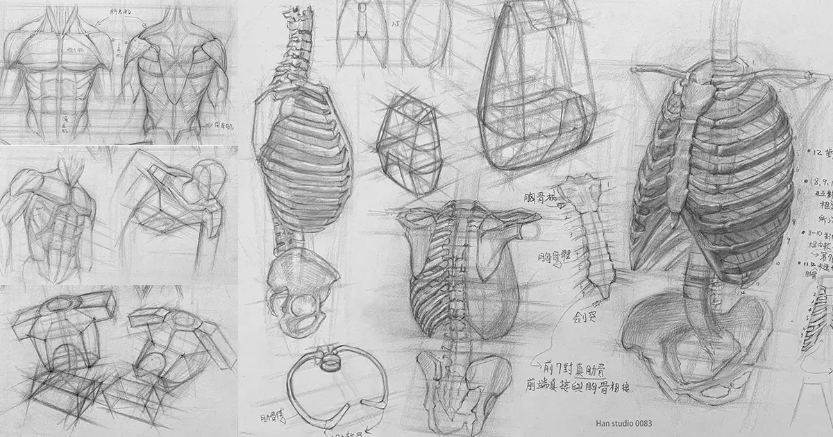
Introduction to Arm Painting: Detailed Analysis of Skeletal Simplification and Movement Mechanisms
Human Skull Sketch: Learn Anatomy for Accurate Portraits
How to accurately grasp the proportions of the hand and sketch the structure of the joints.
How to Draw Ears:Simplified Ear Structure and Shading Tips
How to Use Two-Tone Shading: Simple Shadow Techniques
Facial Muscle Structure Analysis: Enhancing the Stereoscopic Sense of Figure Sketching
How to Draw Japanese Masks: Practical Techniques for Simplifying Shape and Proportional Perspective
From Simple Contours to Detail: Mastering the Sketching of Eyes
Capturing Realism in Lip Drawing: Key Structures and Shading
Portrait Sketching Tips: Three Keys to Understanding Head Structure
Mastering the basic proportions and structure of portrait drawing
How to Learn Perspective Painting: From Geometry to Spatiality
Boots Sketch Tutorial: Learn Proportions and Structural Lines
How to Master the Proportions,Shape, and Symmetry of a Teapot
Three Easy Steps to Drawing a Stuffed Duck with a Pencil
Mastering the Shape and Curvature of a Fishing Boat: Sketching Classroom Fishing Boat Drawing Tips